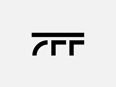
7 Figure Flippers
Logotype concept for 7 Figure Flippers.
-
Working with already established brands is quite different from working with start ups, however, this project is even more complicated than that - 7FF is a prestigious organisation with high-end and invite-only clientèle.
-
They specialize in teaching people in the US how to earn 7 figures by flipping houses in real estate.
-
7FF was recently purchased by a new owner and is going through a complete rebrand process that includes everything from brand strategy to visuals and messaging.
-
7 Figure Flippers is the main organisation that branches out into FlipHack Live and 7 Figure Launch. The challenge is to create a flexible identity system that would put all three under the same umbrella of 7FF parent organisation, but each would be able to stand and represent on its own.
-
The logotype concept for 7 Figure Flippers reflects 7 and F, forming a "superman" like sigil to represent character strenght needed to be able to make 7 figures. The line on top emphasises 7FF as the main, parent company.
