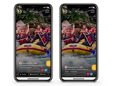
Roposo - UI/UX Enhancement Concept
While using the Roposo App and after reading the reviews on the App Store, I found that there are many users who are finding it difficult to find the Like, Comment and Share buttons So I made them more prominent. Another issue was the comment box was not upfront so I placed it in a location where it can be visible at all times.
Press L to show some love and give your feedback in the comments below. :)
Follow me on
Instagram | LinkedIn | Behance
For work inquiry, drop a mail at
anirudh_saxena@outlook.com
More by Anirudh Saxena View profile
Like
