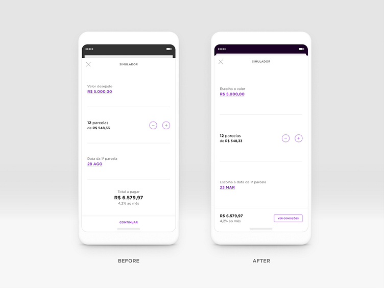
Personal loan's simulator improvements
Software design is never completely done. Here the improvements we made in the personal loan's simulator screens: 1. Checkout section was revamped. Now it uses less spaces, improving the experiences for people with small phones. 2. Labels are now clearer. We see 3x more people adjusting the date of the first installment.
More by Mateus Peixoto View profile
Like

