Courier service logo
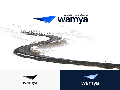
This is a rejected version of my Wamya project. I personally was rooting for this version of the logo as I find it simpler and more abstract, which is my personal preference. The theme for this mark was "effortless speed" and it's somewhere between a bird and a plane. typeface is "LL Circular", Duh! and it has got some of that silicone valley blue going on which I personally love. I wouldn't say this is a finished work. I try to avoid gradients for logos because they're not practical and they go in and out of trend all the time. Overall, one of my favorite projects to date