17th of 100 days of design
100 days if design challenge ,
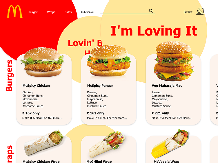
here is a simple redesign of McDonald online website with online order placing. used the two base colors of the brand i.e. red and yellow, and tried to build the website around those colors.
do check the next shot that is related to this one https://dribbble.com/shots/7043513-17th-of-100-days-of-design?utm_source=Clipboard_Shot&utm_campaign=abhi1289&utm_content=17th%20of%20100%20days%20of%20design&utm_medium=Social_Share
More by abhishek gupta View profile
Like
