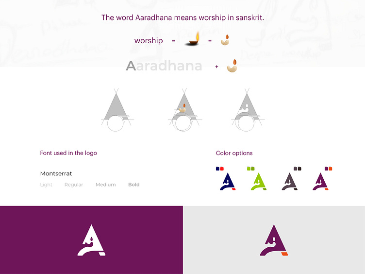
Aaradhana logo concept
This logo was designed for a client who is into dry fruits packaging and processing industry. The name of the firm is Aaradhana, which means worship in Kannada, Sanskrit. So, we thought of depicting worship using dry fruits representation. After a few iterations, we arrived at the above form of the logo. Here, worship symbol is etched in the negative space of the letter A of Aaradhana.
Let us know your opinion on this work.
Drop us an email at hello@thewebpeople.in, if you would like to work with us.
More by The Web People View profile
Like
