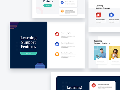
Layout Explorations - Features Section
One of the difficulties of working on a landing page for me is to find a good layout or proportion for each web section. I think some of the designers face the same problem.
So I decided to create a series of layout exploration shots. I took examples from other designers shot as well as my own experience working on paperpillar's project. This first one is a layout for the features section.
I hope that this series of shots could help fellow designers out when working on a landing page.
If you have some feedback, please feel free to let me know.
More by Paperpillar View profile
Like


