Delivery App
🍔Delivery App
🗣I uploaded a work in progress screen of this app in the instagram post. A lot has changed and I would like to talk about the design changes.
[ ✍🏻UI/UX Changes ]
1. Getting rid of bold color
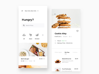
Images are the best source of communication in delivery apps. I didn’t want a bold colors (icon or the green button) to take away the emphasis on images. Now, the color scheme is in shades of black and white.
📸Instagram is a good example of an app that heavily uses shades of black and white to provide emphasis to users’ images.
⌛️In the previous design, your eye probably initially got directed to the green selected-button. In my new design, your eye is directed to the image of the food or your eye will look at the screen as a whole.
2. Change from Round to Square UI ▪️
Rounded corners are cute and friendly, but square UI gives more sense credibility.
🕵🏻♂️Since this is a product where people make purchases on the spot, I wanted to create a feeling of ‘credibility’ through design.
3. Less Padding
Previously, I used 40 px padding for an image of restaurant. I got rid of that entirely. Widening the image brought more emphasis to the image.
[ ✍🏻My Design Focus ]
1. Readability
👁I tried to make every button an adequate size to make it easily clickable, and fonts big enough with decent spacing between every item for good readibility.
2. Usability
⭐️1st Screen: Big Search bar and filter that is out in the open, not hidden behind an icon.
💴2nd Screen $ sign: I tried to show what having one dollar sign means by having 3 other dehighlighted.
🚪Some information are better hidden: I wanted to show whether it is open or not intially, while hinting the user that more details on hours can be seen, once clicked.
🗣Let me know what your thoughts are! I am always open to constructive criticisms as well
☑️copyright JoanneJieunLee
Email: jl2366@cornell.edu
Instagram: joanne.jlee