R3ptile — Brand Refresh
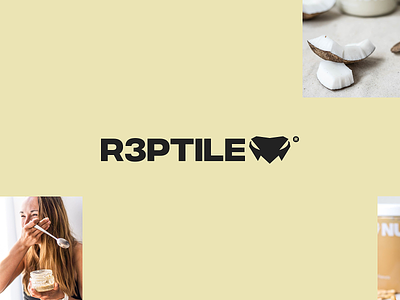
During the website build we've also made a decision to bring the old logo from death and do new round of revisions to it, so it doesn't appeal so edgy, but more of approachable to people, we've changed the angles in the logo itself and revisited the typography.
We went with slightly adjusted Integral CF and changed the sizes / alignment of the typography versus the mark itself.
Feel free to check it out https://r3ptile.com/
More by Charlie View profile
Like


