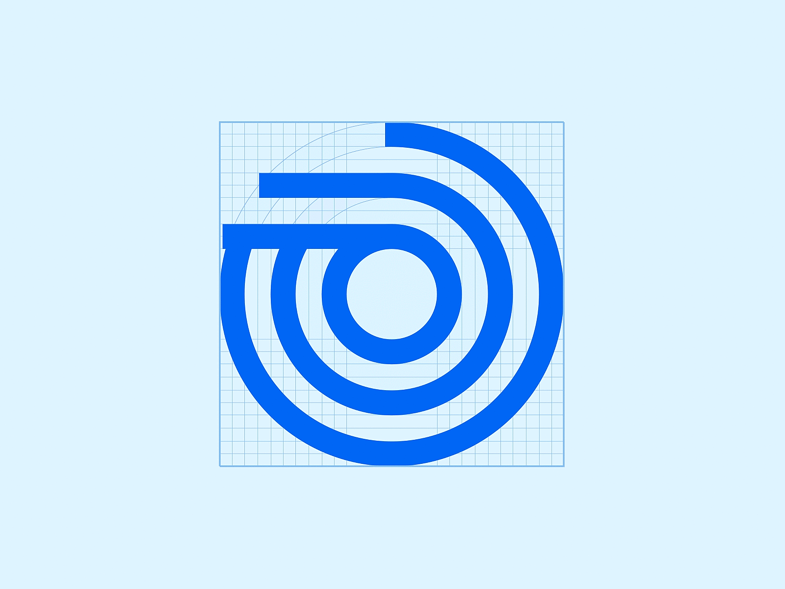
Cowrywise Logomark Construction
We’ve been collaborating with Cowrywise to realign their brand identity and help launch some new amazing products. One of the first things we did was to reconstruct the Logomark from an entirely new grid. This logo scales better because of more consistent elements.
More by Dá Design Studio View profile
Like


