Momotaro Ramen
Momotaro Ramen Brand Design Details 〰️
⠀
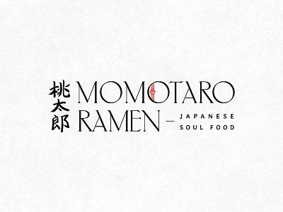
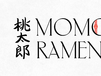
The brush painted calligraphy seen in the Kanji characters for “Momotaro” were painted by hand, in a style of Japanese calligraphy called Kaisho.
⠀
We incorporated the iconic red and white Mizuhiki knot in the second “O” of Momotaro. The knot symbolizes connection, like that shared by those enjoying soul food with loved ones. ⠀
The typeface was chosen for its unique nature and resemblance to the knobby edges of a peach tree's branches, tying into the restaurant's namesake of the Japanese folktale, Momotaro or "Peach Boy."