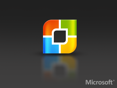
Microsoft Logo (my version)
This company hired me to redo their logo... ahh just kidding :P After seeing Microsoft's new logo updated last week, I couldn't help but throw out a shot of how i'd like to see it. The new logo feels like its in the right step for microsoft (with its simplicity UI in windows 8)... but a tad too simple for my taste :P (i know this one is over styled but it could be a single color also where needed)
Well hope you guys like it, didn't spend too much time w/ it, just whatever came to mind. I kept the same color tones and tried to keep the square style (yet rounded)...
Also... REBOUND this shot if you wanna give a shot at redesigning a Microsoft logo... PRIZE is... you're awesome!
More by David Kovalev View profile
Like
