Branding for Magazine ROCK N' BOARD
About ROCK N' BOARD:
RN'B is a transmedia magazine pioneer of the alternative culture scene of the province of Mendoza, Argentina, one of the digital media that sets trends.
His image should evoke youth and dynamism, but also a solid image.
Work:
I took the main plot lines of RN'B: Urban Art, Music and Action Sports. To give your brand a personality and make it alive.
Solution:
The guiding idea was to create a visual identity that would unite these 3 axes.
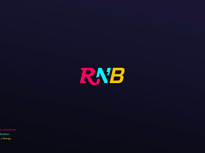
The logo is a compact and solid typographic solution. With a typography that starts talking about a traditional magazine and ends with a dynamism and impact of action sports. But we never stop reading his name; which can be a single word, a sentence or a concept.
The color appears to reinforce these ideas and generate a living palette that has been used in multiple platforms, from screens of all sizes to posters and merchandising.
The logo has a compact variant. The contraction: RNB. This has been the cause of success in applications such as stickers (in all sizes), shirts, hoodies, sponsoring, applications in helmets, racing suits, skates, longboards, etc.
I invite you to see part of the extensive work done for this profound project that after 8 years has become a concept in itself.