Van Morgen — Checkout Flow
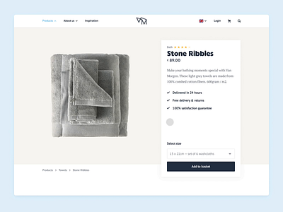
In addition to designing the marketing part of the website, we also worked on the store side. On the product page we show what the brand stands for by sharing all qualitative details of the products with the user.
All Van Morgen’s products are soft and sweet. We wanted the ‘adding to basket’ interaction to feel the same.
More by Strakzat View profile
Like


