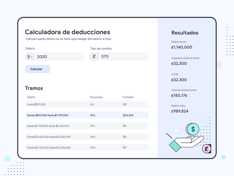
UI Challenge 004 Calculator
Hello guys! This is my interpretation of the UI Challenge 004: Calculator.
I redesigned a mini-app that Arturo Campos created for calculating how much money you are going to get cut from your salary every month due to taxes and insurance.
You can check out the app here: https://arturocr.com/calculadora-deducciones/
In the UX side: -I added a description of the app under the title -I added the colón symbol in the exchange rate field -I added the button to let the user feel he is completing all the steps -I changed the "tramos" part for a table so it would be easier to understand -I changed the "details" word for "results" to clarify that those are the results you are getting by the calculator
In the UI side, I was experimenting with a visual style I've seen that's trending on Dribbble lately that I think it's really colorful and fun, so I wanted to give it a try.
Btw I took the illustration from here: https://icons8.com/
