Tech NY | Logo Concept 3
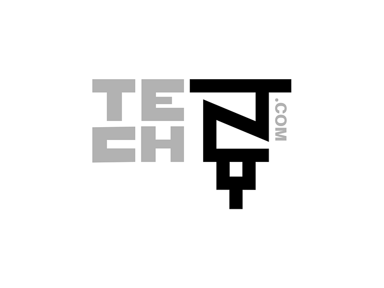
Third and final initial concept for this brand I'm working on. For this one I wanted to incorporate a well-known symbol from NYC into it and the "NY" lended itself nicely to the lines of the empire state building.
It seemed better to flip the empire state building on its head to 1) add a bit of edginess, and 2) it makes the "NY" more legible.
Thoughts, Dribbble?
