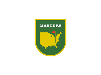
The Masters Logo - for fun
JUST FOR FUN!!
Merging two passions in to one, design and golf.
The Master being one of the most famous and traditional golf tournaments, I thought it would be fun to give it small refresh. For my own entertainment obviously.
I wanted to retain the same feeling, as I said it’s a tournament based around traditions. Its a little update, using simple typography and a simple outline of the US. Adding a shield to give it the prestigious feel.
I’ve come up with a system of logos flexible to use across all medium and channels.
More by James Mortimer (.co) View profile
Like
