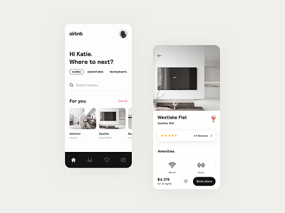
Airbnb concept
Made a visual concept for airbnb over the weekend. The idea was not to design a completely new brand or visual style, just improve the current one as I feel like it's getting outdated.
There's also some UX taken into account like moving the search bar and actions closer to the thumb as phones are getting bigger and bigger. Simplify the palette to achieve a more clean look and feel but at the same time improving contrasts. Write a more concise copy so theres less cognitive load and visual noise and much more.
In the end there's a lot of data and research that the designers at airbnb are considering which I didn't so the design are mainly based on my personal preference and the way I'm using their app.
More by David Huynh View profile
Like

