Logo | She is Wild #2
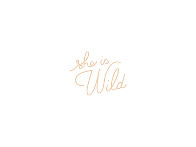

Here is the second proposal that I made for the brand She is Wild.
The logo is totally handwritten to reveal the friendly and feminine aspect of the brand and invites you to travel thanks to its organic forms that recall natural elements. The letters inclination highlights the wild side of She is Wild.
The use of pink reinforces the feminine and delicate side of the brand without taking away its top-of-the-range appearance. .
I’m curious about your feedback. Is it working? 🙃