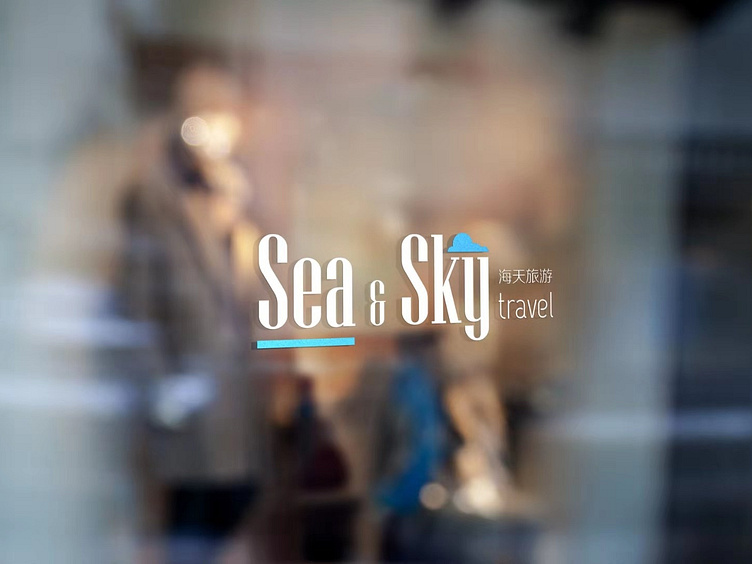
Sea & Sky Travel Logo
The goal of this logo is to present a simple and elegant brand image with the concept of sea & sky embedded within it.
The task given to me was to provide the Sea & Sky traveling agency a rebrand so that they can start to target the younger generation.
Main challenge of this project:
Client's firm was in an industry with many competitors that have logos with proven effectiveness at doing what they were designed to do. The client needed something that stands out more from others, but they also seem more resistant to more progressive designs. It was hard to convince the client to go for a logo concept that may fit their actual needs since they are more traditional and risk-averse.
Various more colorful and playful designs were attempted since a lot of the logo design of similar traveling agencies were designed to send out a more cheerful vibe. However, the client chooses the above logo design since they wanted themselves to be more than just a small traveling agency that targets young Chinese clients. The client wanted to grow Sea & Sky intro a nationwide traveling agency that also serves the English speaking population.
The light blue color was selected to replace their original deep navy blue color as their primary brand color. The reason behind it is that this more luminous sky blue color can be seen as a more youthful and refreshing color. It can represent both the color of the ocean and the sky at the same time. The concept of the sea and the sky have been successfully portrayed in this logo by incorporating the primary blue color in the form of a line and a cluster of cloud.
This particular font was chosen for this logo due to its ability to present both a sense of professionalism and a feeling of elegance. The edges of the font look well crafted, and the extra thin complementary font also helps to give viewers a sense that this firm has excellent attention to details.
Overall, the clean and straightforward wordmark logo, with the inclusion of icons, was able to fit the conservative taste of my clients and still remain different enough when compared to other similar agencies.
