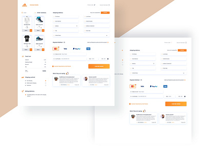
Checkout Web UI design V. oRange
Hey Guys!!!
It's my pleasure to share with you my new shot on the Checkout Web UI design! It's an orange version of my previous work. Looks Good, isn't it?
Let me know what you think about the shot?
Hope you all enjoy it.
Connect with- Facebook | Twitter | Behance | Linkedin
I am available for making your thoughts come to live.
📢 Shout at oneykhan59@gmail.com
Press L to ❤️.
More by Shahriar Khan 🤘 View profile
Like
