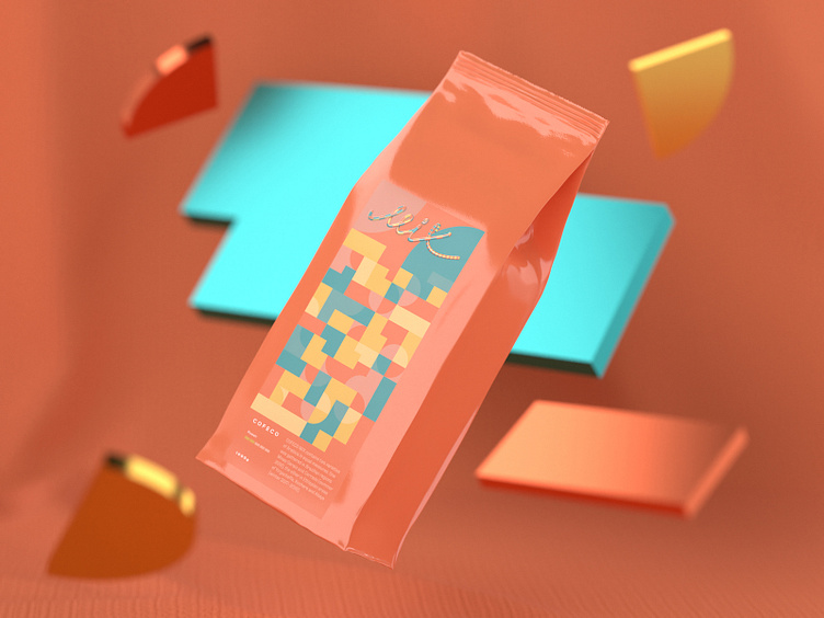
C O F E C O
The objective was to do naming and package design for 3 types of coffee and to create general product branding. It was required to avoid any direct references to a coffee crop. We aimed for a simple and neat visual concept. Product name derived from a word "coffee" merged with "co" ("company" abbreviation). That's how we came to a minimal yet substantial name COFECO while getting rid of all unnecessary elements if we may say so. Product name turned out to be quite simple yet "tasty". While working on package design it was decided to stick to geometric pattern theme. The line is represented by 3 coffee types, they are SILVER, GOLD & MIX. Their visual design corresponds to the names & flavour notes of each particular type. In future COFECO is also going to produce their designer coffee cups. All renders was made in Adobe Dimension Design was made in Adobe Illustration Silver, Gold and Mix lettering was create in Cinema 4D full project on Behance https://www.behance.net/gallery/84256865/C-O-F-E-C-O
