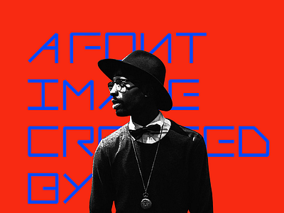
KangD-Font-Design
KangD Font Design
DesingnerKang FontDesign Project Branding eXperience
The designer's meaning is in the set box.
a straight line of unique and simple
It's font design.
If you're a designer, even an individual, I think we need a brand. Especially when we share a lot of things online, just like the current
situation. I think using the brand in a common direction helps to remember designers.
The personal logo conceived "Shared + River + Design" in a square box.
In this box, if you look at it in detail, it's lines to express "sharing design ideas." And the alphabet, "K," found in the name "Gang,"
represents the personal brand and direction behind the design.
The lines in this boxed space support multilateral communication, where ideas, ideas and expressions all fit into this space. Finally,
red-colored bold strokes were applied to emphasize passion for design and sharing.
