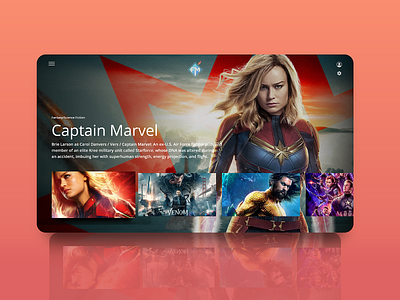
FollowMedia Smart Television
This was a design project I had worked on a few months back. I was really excited to be learning about designing for new types of devices.
I still remember a few sets of rules to be followed while designing for smartTV like: -10 feet rule: Bare minimum of 10 feet readable distance and typography be used. -18 minimum font size. -Not using pure white (#fff) for tv devices as they have brighter displays compared to monitors and can harm eyes at a near distance. -3-row grid for Smart TV and so on.
I will post the resources and design process on my Behance profile. Reach me at nis.kharel@gmail.com
More by Nischal Kharel View profile
Like
