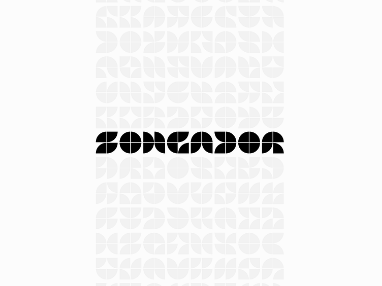
Songador generations
This rejected direction for a recent logo job still appeals to me. The company is developing a non-linear audio composition platform for artists that does for music what cubism did for art. Instead of traditional structuring, users will be able to compose segments of songs individually. Listeners will likely never hear the same composition twice, as each song rewrites itself each time it's played.
Each letterform in the wordmark is created from the same 4 identical circle segments, suggesting how the same few pieces can be rearranged to create (practically) endless variations.
I initially wanted to develop a dynamic logomark to reflect the nature of the product, but a limited budget and timeline prevented it. This was a strong alternative, especially since the interface utilizes flat styling and circular elements.
