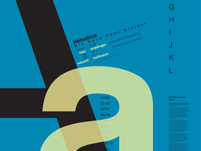
Typography through the Centuries—Helvetica
This series of 30" x 40" posters showcases three influential fonts in the history of typography, highlighting their unique features and drawing inspiration from how each font was originally used. Featured fonts include: Fette Fraktur, the most beloved of the Blackletter fonts; Baskerville, the trademark of transitional serif fonts; and the modern epitome of Swiss International typography, Helvetica. Emphasis is placed on the aims and ideals of typography in these fonts over 100 years.
The Preludin leaflet, designed by Fred Troller, as well as other paragraph forms by Joseph Müller-Brockman and Emil Ruder, served as inspiration for a paragraph placement which would not distract from the Helvetica poster's larger message. Bold, dominant molds combined with delicate diagonals and distinct paragraph shapes reinforce Helvetica's neutral structural simplicity, which allows the information in the message to speak for itself.
