Typography through the Centuries—Baskerville
This series of 30" x 40" posters showcases three influential fonts in the history of typography, highlighting their unique features and drawing inspiration from how each font was originally used. Featured fonts include: Fette Fraktur, the most beloved of the Blackletter fonts; Baskerville, the trademark of transitional serif fonts; and the modern epitome of Swiss International typography, Helvetica. Emphasis is placed on the aims and ideals of typography in these fonts over 100 years.
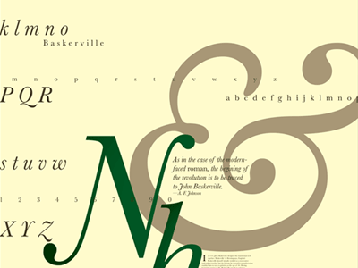
For John Baskerville's namesake font, I drew attention to those beautiful cursive forms for which it is most highly praised. The creamy color of the paper and rich green ink for the text recalls Baskerville's penchant for control as epitomized in his creating his own paper and ink to guarantee the font would appear as intended.
