Typography through the Centuries—Fette Fraktur
This series of 30" x 40" posters showcases three influential fonts in the history of typography, highlighting their unique features and drawing inspiration from how each font was originally used. Featured fonts include: Fette Fraktur, the most beloved of the Blackletter fonts; Baskerville, the trademark of transitional serif fonts; and the modern epitome of Swiss International typography, Helvetica. Emphasis is placed on the aims and ideals of typography in these fonts over 100 years.
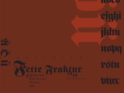
Fette Fraktur is portrayed in dark, rich colors to reflect its Gothic origins. The poster includes elaborate center-aligned paragraphs proudly displaying the umlauts and ettsetts due to its genesis and popularity in German-speaking countries.
