New Logo
The story of this logo is a bit weird, but very close to me.
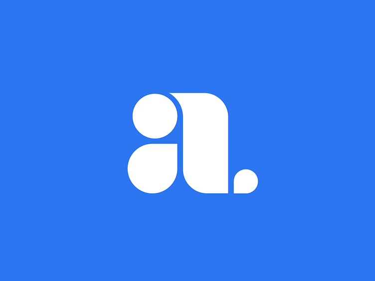
I decided to design a tattoo for myself, representing my family: wife, two kids, and I. Our names all start with the letter A, so that was the base of the idea.
Roughly at the same time, I wanted to change my website logo. In the past, I've used my initials (AV) as a starting point, but this time I wanted to simplify it to a letter A, going also with the style I wanted for the website and my personal brand. I also knew I wanted something built on geometric shapes, both for a retro feel and to convey my professional mix of design and engineering.
This is the result of all of the above. Is both a logo I'm damn happy with, and also a tattoo (yet to happen). In the latter, each shape represents one member of my family, from the big dad to the tiny toddler.
<3