Prymax Website
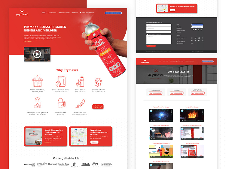
This is a website design for Prymax, an extinguisher company in Europe. This is the re-design of their website
Actually, I think the old website is good enough, but not very good in the hierarchy placement for the section. They place every content neatly, but I think some content need to show up, like the features of the product, introduction video, and the product itself.
They also need something for their visual brand, because we know every extinguisher company has common style. I give a little touch, dot pattern illustration, to distinguish them. I really love the illustration. I think the dot pattern really suits the sprayer. It's like it sprinkles the liquid inside the can. Haha a random though, but I Ilike it
More by Rezkytama Putra View profile
Like
