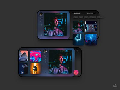
Landscape Dark Instagram Concept
Haven’t seen much of apps trying to utilise landscape experiences much these days, this dark Instagram concept is a vertical and side-scrolling redesign of the search and explore section, which allows a user to see an enlarged image in the stream and also side scroll to see more from a profile and then a floating follow button. What do y’all think? Is dark UI just another fad? 💣🔫
--
Hit us up at hello@wediscover.com.au to discuss your next digital project.
More by We Discover The Design Thinking Agency ™ View profile
Like


