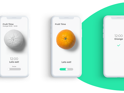
Fruit Reminder App - Fruit Screens "Orange"
I think this shot shows more clearly what I was talking in the last post. The idea of swiping when the Fruit Reminder informs you its time to eat and in that way going form clean white painted orange to normal orange gives me a feeling of mini pleasure and that is I think what users also want to feel as they use digital products. Please share your thoughts with me on this topic and make sure you check the full project on Behance "https://www.behance.net/gallery/83765705/UIUX-Design-for-Fruit-Reminder-App"
More by Jovan Marinkovic View profile
Like
