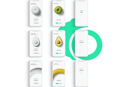
UI/UX Design for Fruit Reminder App - Fruit Screens
The goal was to present the fruit in a way other than illustration to achieve that natural feeling. I played a bit with showing the fruit that is colored in white first and after confirming the action of eating it becomes the right normal color, in this way clean design was achieved and each interaction with the app resulted in a colored reward! Tell me what you think about it.
Full Project: https://www.behance.net/gallery/83765705/UIUX-Design-for-Fruit-Reminder-App
More by Jovan Marinkovic View profile
Like
