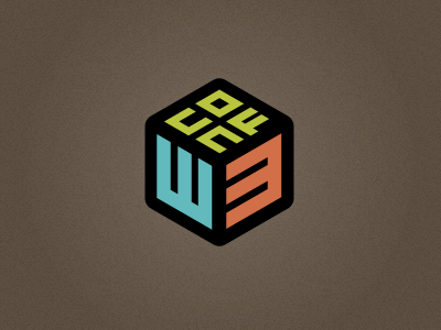
W3Conf logo concept with improved legibility
Same idea, swapped the sides of the "CONF" and 3 to make it more legible. It loses the mirroring of the W and 3 which I liked in the previous one, but that’s exactly what hindered its legibility. I also removed the starburst from the background since many people thought it was part of the logo.
More by Lea Verou View profile
Like

