PACELINE POWER Logo Design
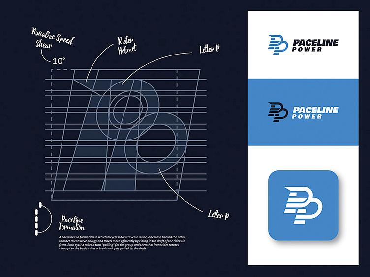
This is logo concept Paceline Power. The logo formed from 2 elements, that is icon and wordmark. The icon represent 5 line (horizontal), because in 1 line usually consists of 5 riders. Top of line, do backwards in 4th line. It just to visualize a strategy in paceline. Overall, the icon forming letter PP (italic) to represent Paceline Power itself. Italic letter means that this sports rely on speed. It looks like sprint runner who leaned forward. Also the top of line represent like a helmet rider which formed to control the wind. Blue color combination is just perfect color to describe paceline power itself which illustrate peace and technology orientation.
