Keep Thick and Thin Strokes consistent
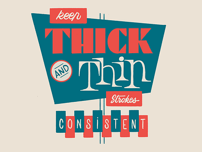
Lately I have partnered with @fontself for a couple of illustration work about typographic tips while creating lettering or a font. Here is one of these Illustrations. I will publish some others the coming days. I particularly like this one as it is a duotone work and I found not easy to deal with neons style and only work with 2 colors 😜
What do you think?