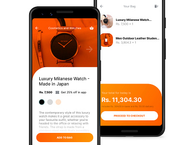
Reimagining Bhatbhateni Experience
So here is the fourth entry to the #Redesigned series. This time, it's Bhatbhateni.
I downloaded the app a few days ago and was appalled by the poor quality of design and lack of products in the store. It's kind of embarrassing for the biggest retail chain in the country to have such low standards. Their performance is low and looks odd. So I took a stab at it and redid the product info page and the shopping bag section.
Do you like what you see? Hit Like to show your appreciation and leave a comment.
Find me on Uplabs | Facebook
More by Swapnil Acharya View profile
Like


