Orchard Financial Group
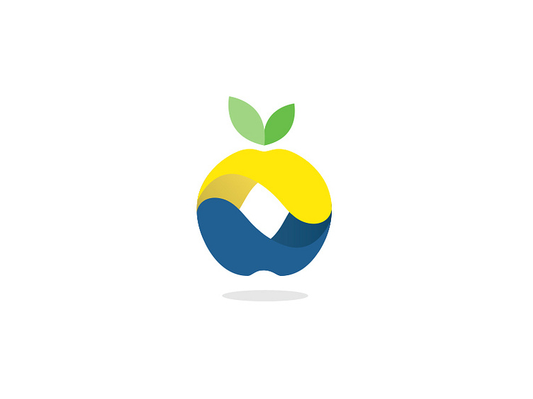
Form: Looking to position Orchard Financial as an educator, and in keeping true to the most common fruit associated with the word "Orchard" the use of an apple was a no brainer. Focusing on communicating balance with a yin-yang flow between a financial advisor and client. The use of primary colors, blue, yellow, and green enabled me to do just that.
Color: From the base up, we start with blue, blue is emotionally symbolic for trust, responsibility, honesty, and structure. It is used to express order, security, and create calmness. All the virtues that are perfect for building a strong foundation. Something you would need when building a relationship with a financial advisor.
Yellow is emotionally symbolic for enthusiasm, happiness, opportunity, and is commonly used to stimulate, create awareness, and energize. Orchard Financial wants to excite their client's about the freedom they can achieve with a balance between structure, opportunity, and awareness.
Which is where you see that ying-yang flow within the form of the logo.
Lastly, we have green; green is emotionally symbolic for growth, harmony, dependability. It is commonly used to display growth, balance, and success.
Remember back to when you were a child mixing paint in elementary school when you learned that with the perfect balance of yellow and blue, you would get green.
The emotional and psychological values attributed to each core color of blue and yellow, equally result in the success values associated with green.
It was the perfect way to complete this 3 tier color structure for the Orchard Financial icon.
