Food Order App UX/UI
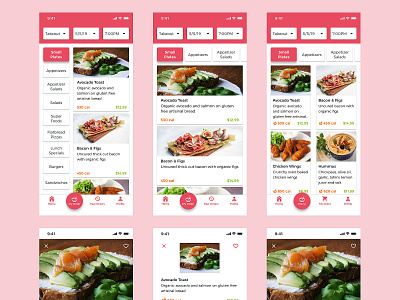
I played around with the positioning and aesthetic of categories(filters) and items. The key thing here is maximizing the screen real estate WITHOUT neglecting important information about the item.
Users want to get to point B in as little steps as possible.
Which variations do you like best?
Feel free to feedback and comment. don't forget press "L" if love it. Thanks!
