Fitted
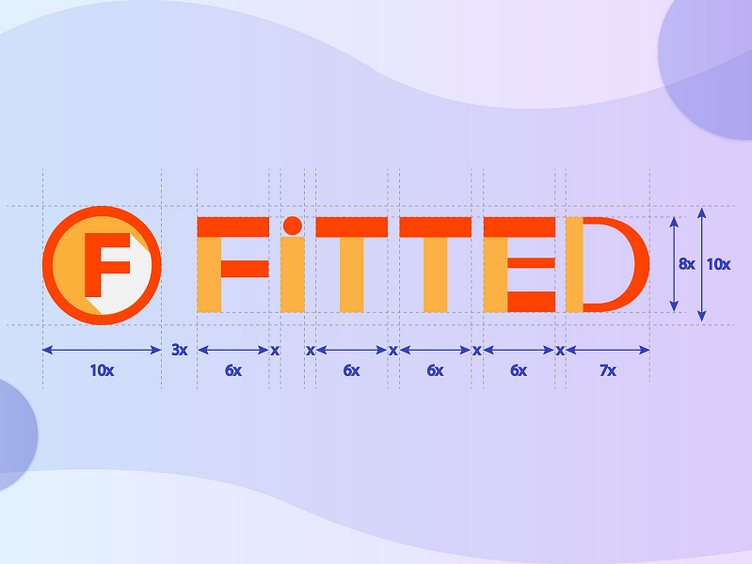
I designed this logo for a fitness mobile app Fitted. I was inspired by the Sans-serif fonts when designing the typeface for the logo. The brand is meant to be vibrant and bright, playful but reliable. I kept the "i" lower case while making the others capitalized to create an impression of fun and friendliness. Besides, I designed an initial letter "F" with the letter shadow as an abstract element to represent the brand. "F" could be associated with "Fun," "Focus," and "Fitted". Finally, I use two primary colors, orange and yellow, for the logo according to the brand color palette I previously created.
