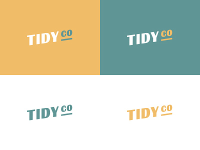
Tidyco Logo Version 2
I went back and updated the logo for Tidyco. The more I looked at the original, the more I disliked it. The colour were too bland for it to stand out which I drastically changed in this version. I then changed the font to something a little more unique (Britannic Bold).
More by James Healy View profile
Like
