B&L Monogram
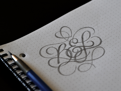

First draft of a tattoo design for my wife that incorporates our kids first initials. Still working out the thicks and thins and where they should be and would love some feedback if you see anything particularly crazy. I already see I need to work on the spacing under the ampersand there.
Specific thought: does the ampersand look too much like an 'E'? Haven't drawn many in this style, so still trying to get comfortable with it, lol.
Peep the attachment for a bigger version of this, a detail shot showing some of my failed attempts in the paper, and the actual scan for a straight-on look.