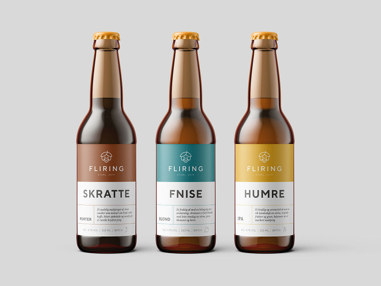
Brand identity for Fliring micro brewery
Despite the name (fliring = laughing in Norwegian) this local micro brewery is no laughing matter – owner Robert is pretty serious about great craft beer!
Robert wanted a clean and modern brand identity, with personality and an element of humour and warmth. The happy hoppy logo icon is just that; a minimal line illustration that is also slightly tongue-in-cheek and fun. C’mon, tell me this happy hoppy chap didn’t bring out a little smile? Coupled with clean sans serif typography and a warm, saturated colour palette, this brand identity has pints of personality!
Bottle labels are kept simple too, making them easy for the client to customise, edit the text, and even add more variations by editing the pre-designed template. In combination with digital printing, this keeps short runs affordable – and easy!
