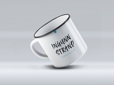
Rebrand for Ingunn Strand / Blueevents.no
Personal branding is the practice of people marketing themselves and their careers as brands, and it’s becoming increasingly more common to take on this approach when branding a solo venture. The norm used to be to try and look like a big corporation even when your business consisted of… umm… just you basically. Writing “we” and “us” and not letting your personality shine through, because that was somehow perceived as “more professional”. Bah! I call bullshit! And I’m so happy to see a shift towards a more relaxed and fun (but still professional!) way of doing things. As a solopreneur, showing the real person behind the brand will not only give you a tonne of credibility and boost the all-important know, like and trust factor – it will also help you attract clients that really get you and what you’re all about. And that, my friend, is magic!
I’ve known Ingunn for a while now, so when she approached me to help her build her personal brand, I was thrilled! Ingunn is the founder and owner of Blueevents.no, where she tailors exclusive and inspiring corporate events and executive summits – with a twist. There wasn’t technically anything wrong about her previous brand identity, but it did her no favours in terms of differentiating her brand from a whole bunch of other corporate event planning agencies. There was no sign of the person behind the brand, and that was such a shame because Ingunn is super cool!
So what did we do? Well, she told me what she was looking for, and I went away and created two design concepts that fit the bill on paper, and one wildcard. Guess which one spoke to her gut?
The first thing we did was to turn things on their head. Whereas before, Blueevents.no took centre stage and Ingunn was left in a dark corner (quote the famous movie line, anyone?), now the attention is turned to the lead role: Ingunn Strand. In the chosen design concept, I’ve brought in an element of attitude with a raw brush font for the logo and large headlines, but kept it balanced with a sleek grotesque typeface for the main typography. A slate grey and vivid turquoise colour palette makes this a show stopper, and is in line with Ingunn’s preferences. Her previous logo design featured the silhouette of two houses, and one of these was retained and turned into an abstract decorative detail in the new brand identity. Edgy brand portraits by Paredes complete the transformation.
