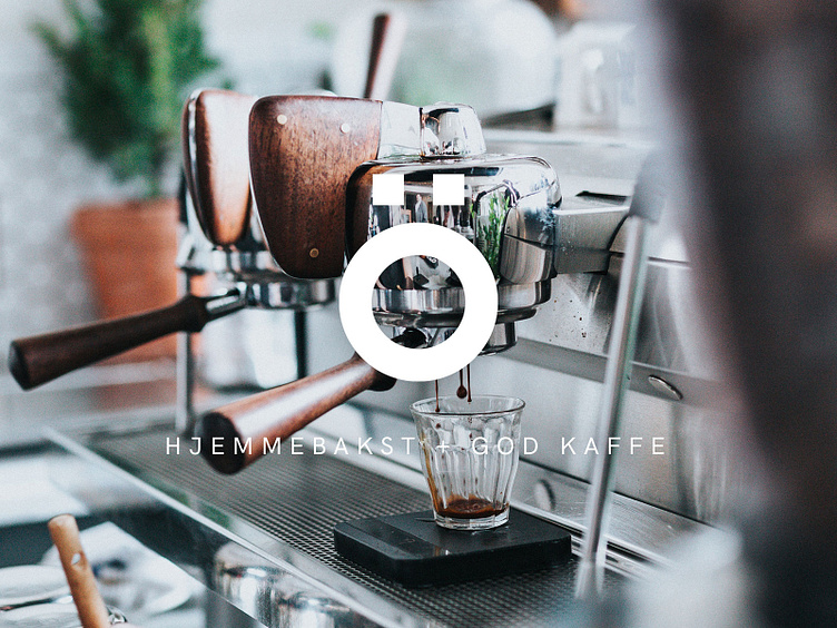
Brand identity for Õ
On the island of Tjøtta in northern Norway, surrounded by fantastic scenery, lies a listed building. In the basement of this building, carefully curated art will be framed by thick stone walls oozing of raw and rustic character. There are also some exciting plans for a gallery café. How can it not be awesome?!
Owner Elisabeth had a clear vision for Galleri Ö’s brand identity: it needed to be striking and bold, yet understated enough to not distract from the art she’ll be exhibiting. With this in mind, we went all-in on a minimal black and white colour palette in combination with HK Grotesk, a sans serif typeface inspired by the classic grotesques. The Ö is used on its own, and in combination with descriptive text. This approach allows for great flexibility, say if she ever wanted to extend the concept to include other products/services too at some point.
