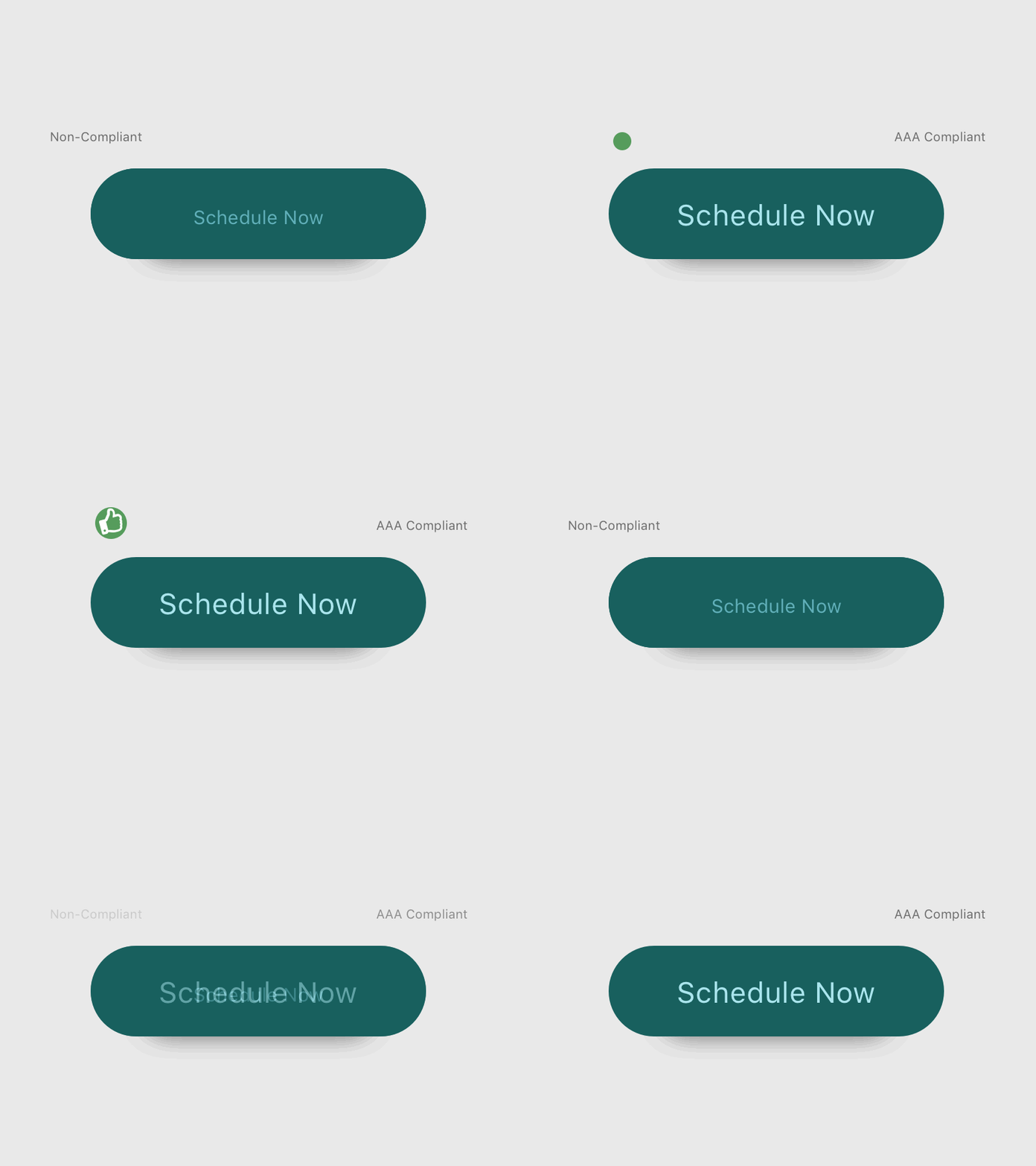
Accessible Button Comparison
Played around with a GIF that shows a button visual accessibility comparison. Not sure why it has a skip in it, definitely need to experiment more with my frames.
Non-Compliant
Small text
Low contrast (#18605E background, #60AFB9 foreground)
Contrast Ratio: 2.89
AAA Compliant
Larger text
High contrast (#18605E background, #C3E7ED foreground)
Contrast Ratio: 5.55
More by Ariana Dufour View profile
Like


