Figma Material Design System Guidelines
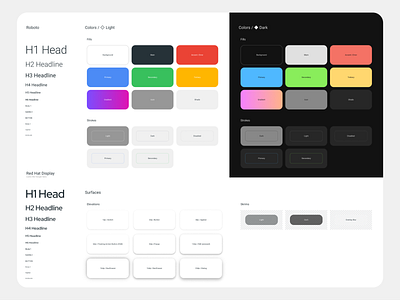
Figma Material Design System 3 - the biggest material design kit ever made for Figma. Hundreds of perfectly crafted UI components. 100% material.io guidelines compliance + Dark theme
Styleguides include:
✔ Font pairing combination: Roboto + Red Hat Display (looks like Google Product Sans font)
✔ Independent color styles for default & dark theme
✔ Detailed elevation for Switches, Buttons, Appbars, FAB, Popups, Navigation drawers, Dialogs
✔ All styles are flexible and adjustable, so you can quickly set your custom identity and brand colors
Get started here! ▶ https://setproduct.com/material
figma_material_design_system_3_lite.fig
5 MB
More by Roman Kamushken View profile
Like

