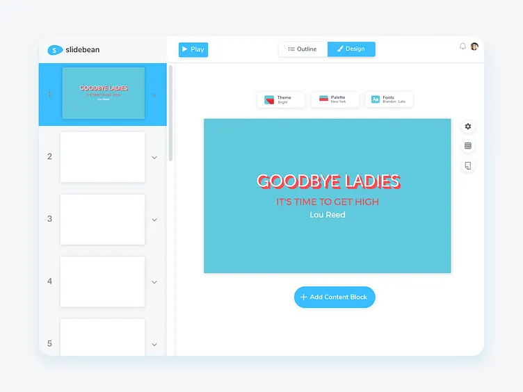
Design Editor Redesign
I made this proposal for Slidebean's design editor a while ago.
What I did:
👉🏻I redesigned the editor in lighter tones so that the slides would have better contrast with the background, and it wouldn't feel so crowded; also, the lighter tones are more cohesive with the dashboard of the app.
👉🏻I redesigned the "design menu" so it would be easier to find by the users. First, I placed the menu near the slide for it to have more hierarchy and I redesigned the buttons so they always show their active state and the user can know exactly which theme, color palette or fonts is using at the moment.
You can see the original design editor in here: https://ibb.co/PgkVZJz
More by Sofia Mora View profile
Like
