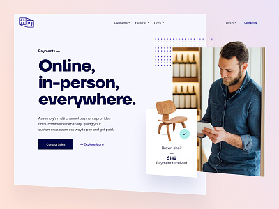
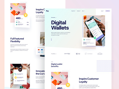
Assembly Payments - Home
Hi there folks,
For the past few months, we worked closely with the Assembly Payments team to completely redefine their online presence.
We helped them define a new visual language, create a new website and build it out using Webflow.
Client
Assembly Payments is an Australian based tech company striving to simplify and unify commerce experience. They provide multi-faceted payment capability, giving your customers a seamless way to pay and get paid. Basically, a better way to run your commerce service.
Our role
We were tasked to take the current website and visualize a new direction for the brand. In the process modernizing and unifying the whole visual language by introducing a completely refreshed color scheme, typography system, and design treatment.
With the help of the Assembly team, we completely restructured the navigation, page-to-page communication, and overall information architecture.
The goal was to deliver a friendlier digital experience for their customers, as well as tie in all the pages within a singular and unique design language that is the new Assembly Payments.
You can check them live at: https://assemblypayments.com/
The final product has been slightly overhauled to accommodate some of the client requirements.
Also, a cleaner representation of our vision might be found in the attachments.


