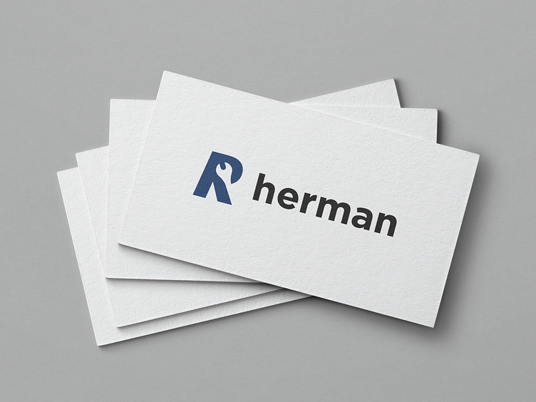
Mechanic logo.
To choose a great color palette is not always easy, especially when you are working with brand that has a lot of competitors so your goal is to make it stand out. _ For this company,I picked a blue because it symbolizes seriousness , trust and confidence. I also picked this typeface ( gotham ) because its compatible with the mark. _ Enjoy your day design people 😁. _ Would you like to work with me? Send me a message on IG or contact me at emir.kudic01@gmail.com
More by Emir Kudic View profile
Like
